The WHAT
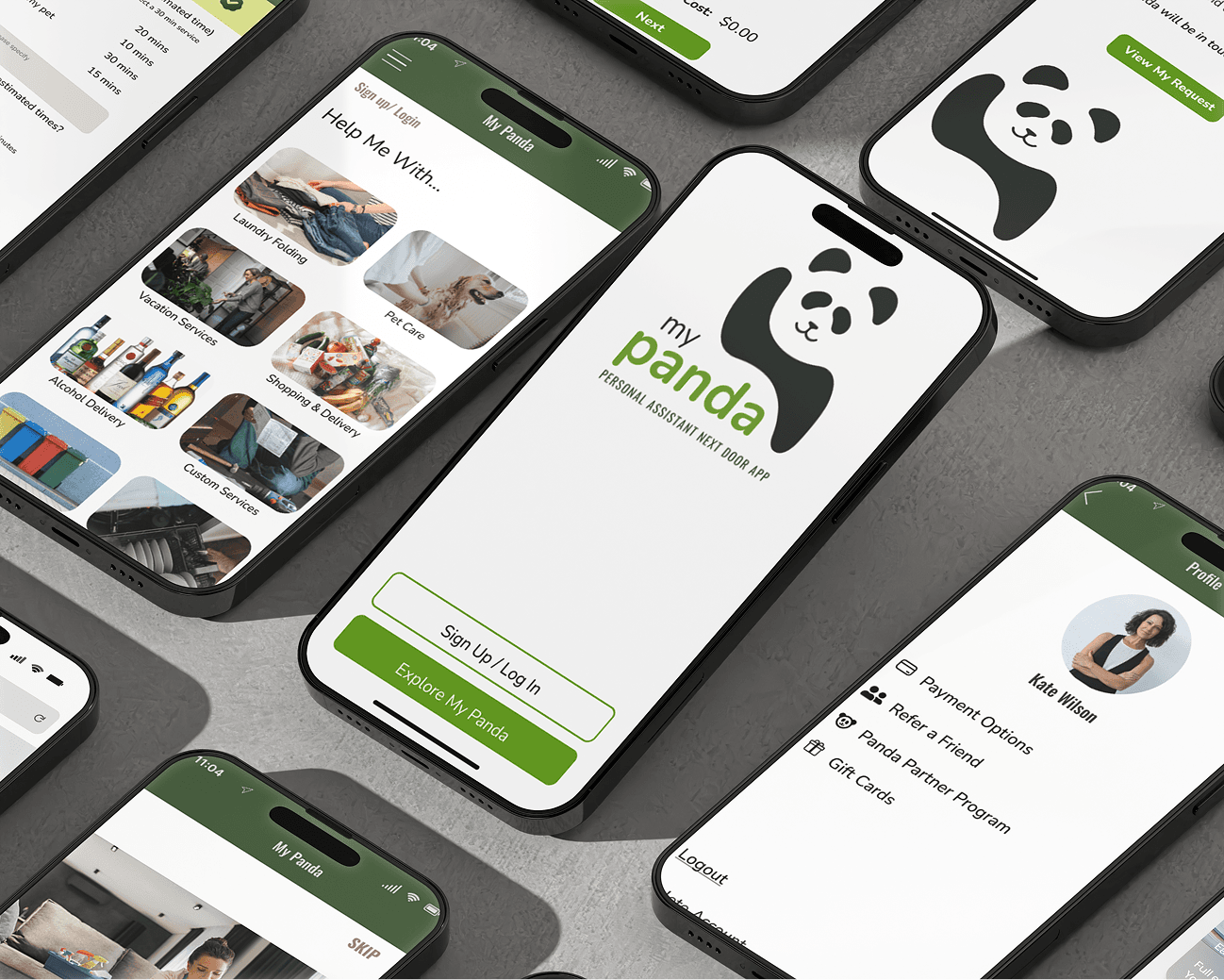
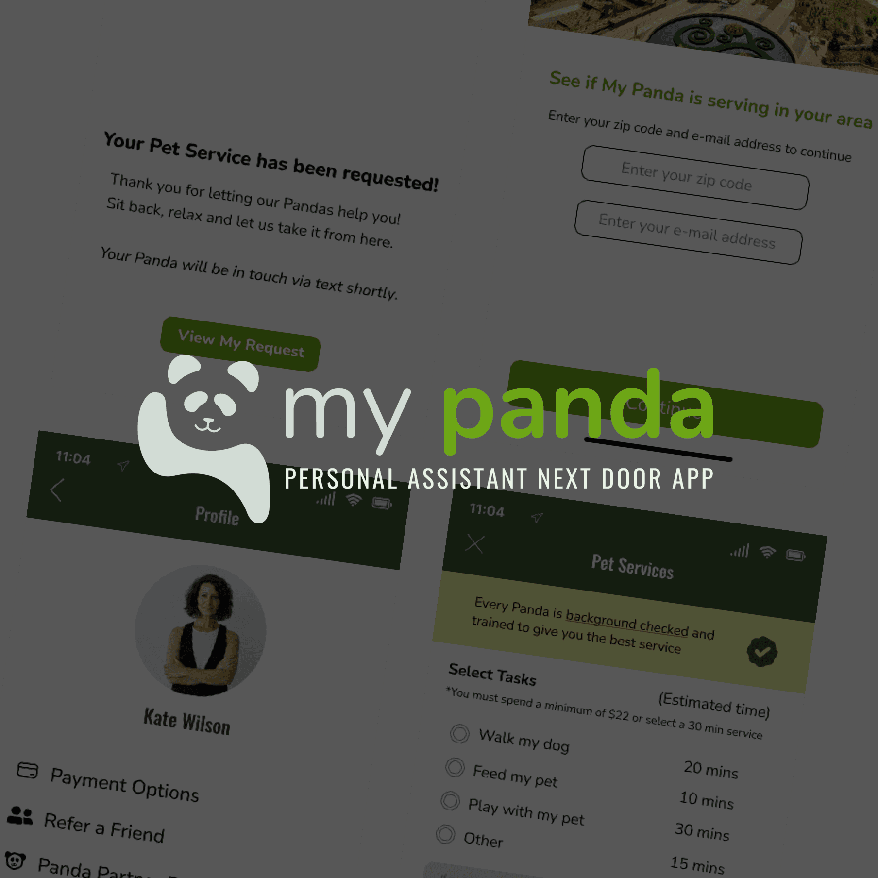
My Panda (Personal Assistants Next Door App) connects working women with limited time and different needs to versatile and trusted help from within their own community. The personal assistants (Panda's) are hired to complete tasks such as grocery shopping, pet care, and home cleaning amongst other customizable services.
Think: TaskRabbit


CURRENT MENU
REDESIGNED MENU


MY PANDA
Role
Lead UX / UI Product Designer
Industry
Gig Economy
Contributions
App Redesign / UX Research / UI Design / Product Design / Information Architecture
Service
B2C
My Panda, an app connecting working women with local personal assistants, struggled with user confusion and high abandonment rates. As the lead designer, I spearheaded a complete app redesign, focusing on user interviews to understand core issues. By implementing an intuitive onboarding tutorial and a transparent, tiered-pricing booking process, we significantly increased user understanding and confidence. This resulted in a 54.47% increase in SUS score, a 22% decrease in app abandonment, and a 17% increase in revenue, proving that clarity and trust are key to conversion.
My Panda, an app connecting working women with local personal assistants, struggled with user confusion and high abandonment rates. As the lead designer, I spearheaded a complete app redesign, focusing on user interviews to understand core issues. By implementing an intuitive onboarding tutorial and a transparent, tiered-pricing booking process, we significantly increased user understanding and confidence. This resulted in a 54.47% increase in SUS score, a 22% decrease in app abandonment, and a 17% increase in revenue, proving that clarity and trust are key to conversion.
CURRENT MENU
REDESIGNED MENU
CURRENT MENU
REDESIGNED MENU
the CHALLENGE
Our PROBLEM
Without important conversions with the customers and the hired personal assistants, my team would have focused on the wrong MVP. Our problem was that customers weren't completing the checkout process and not upgrading their services to spend more. So we focused on every step from downloading the app to booking to completion of checkout. Our initial "solution" was to provide more clarity in the UX and absolution in the UI when booking a service. However through user interviews, we came to realize that customers really just didn't even understand how the current app functioned.
Our SOLUTION
Since the current app did not have any sort of Onboarding or Tutorial, I tested and designed and tested and re-designed an onboarding carousel for first time users.
The current booking process left much to be desired in terms of comprehension and appearance. Customers weren't sure what they were paying for and how much they were paying until checkout. I tested and designed and tested and re-designed a transparent booking process that also allowed the customer to upgrade with a discount.
CURRENT MENU
REDESIGNED MENU

CURRENT HOME SCREEN

REDESIGNED HOME SCREEN
CURRENT HOME SCREEN
CURRENT HOME SCREEN
REDESIGNED HOME SCREEN
RELATED UX / UI PROJECTS
REALIFT
REALIFT
REALIFT

NATURAL GROCERS {N} POWER
NATURAL GROCERS {N} POWER
NATURAL GROCERS {N} POWER
MY PANDA
MY PANDA
MY PANDA