The WHAT
Natural Grocers never had a native app before our team worked relentlessly on it. Their major business goal was to push their newly launched {N}power Rewards Program so their customers could track coupons and promotions. Not only could their customers
Natural Grocers never had a native app before our team worked relentlessly on it. Their major business goal was to push their newly launched {N}power Rewards Program so their customers could track coupons and promotions. Not only could their customers


CURRENT MENU
REDESIGNED MENU


NATURAL GROCERS {N} POWER

Role
UX / UI Designer
Industry
Consumer Goods
Contributions
UX Research / UI Design
Service
B2C
CURRENT MENU
REDESIGNED MENU
the CHALLENGE
OUR PROBLEM
Customers often struggle to find the right content quickly due to poor navigation, confusing categorization, and ineffective search filters. Without a clear structure, they end up frustrated, bouncing from pages without finding what they need. By improving card sorting, taxonomy, filtering, and tagging, we can create a more intuitive experience that aligns with user expectations. The goal was to make information easily discoverable, reduce friction in search interactions, and ensure users get to their desired content faster and with less frustration.
OUR SOLUTION
When you're in a grocery store and you don't know where something is, the traditional way to find your item would be to ask someone or look up at the top of the aisles to find categorized keywords. We wanted our search functionality to work the same way.
CURRENT MENU
REDESIGNED MENU

CURRENT HOME SCREEN

REDESIGNED HOME SCREEN
CURRENT HOME SCREEN
CURRENT HOME SCREEN
REDESIGNED HOME SCREEN
RELATED UX / UI PROJECTS
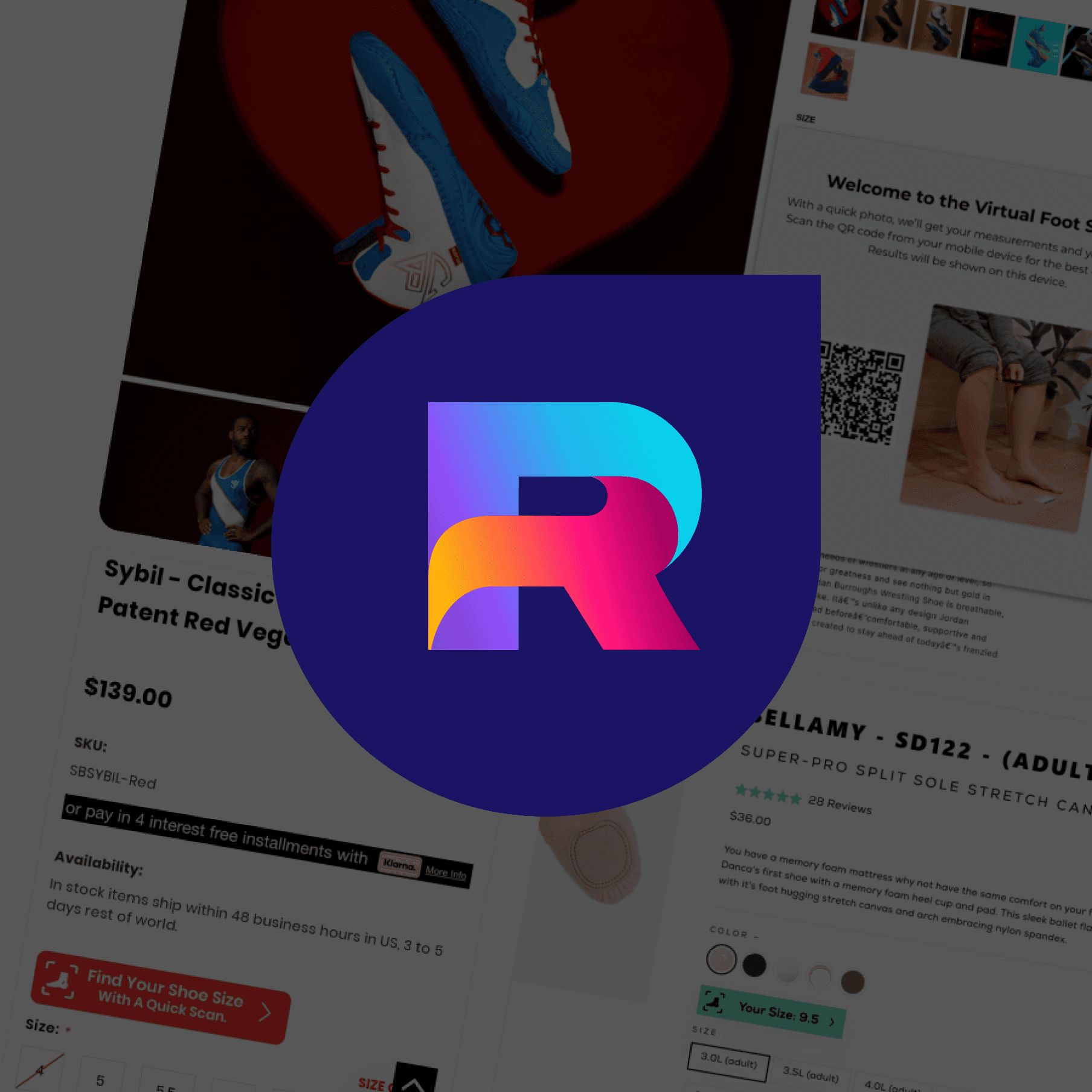
REALIFT
REALIFT
REALIFT

NATURAL GROCERS {N} POWER
NATURAL GROCERS {N} POWER
NATURAL GROCERS {N} POWER
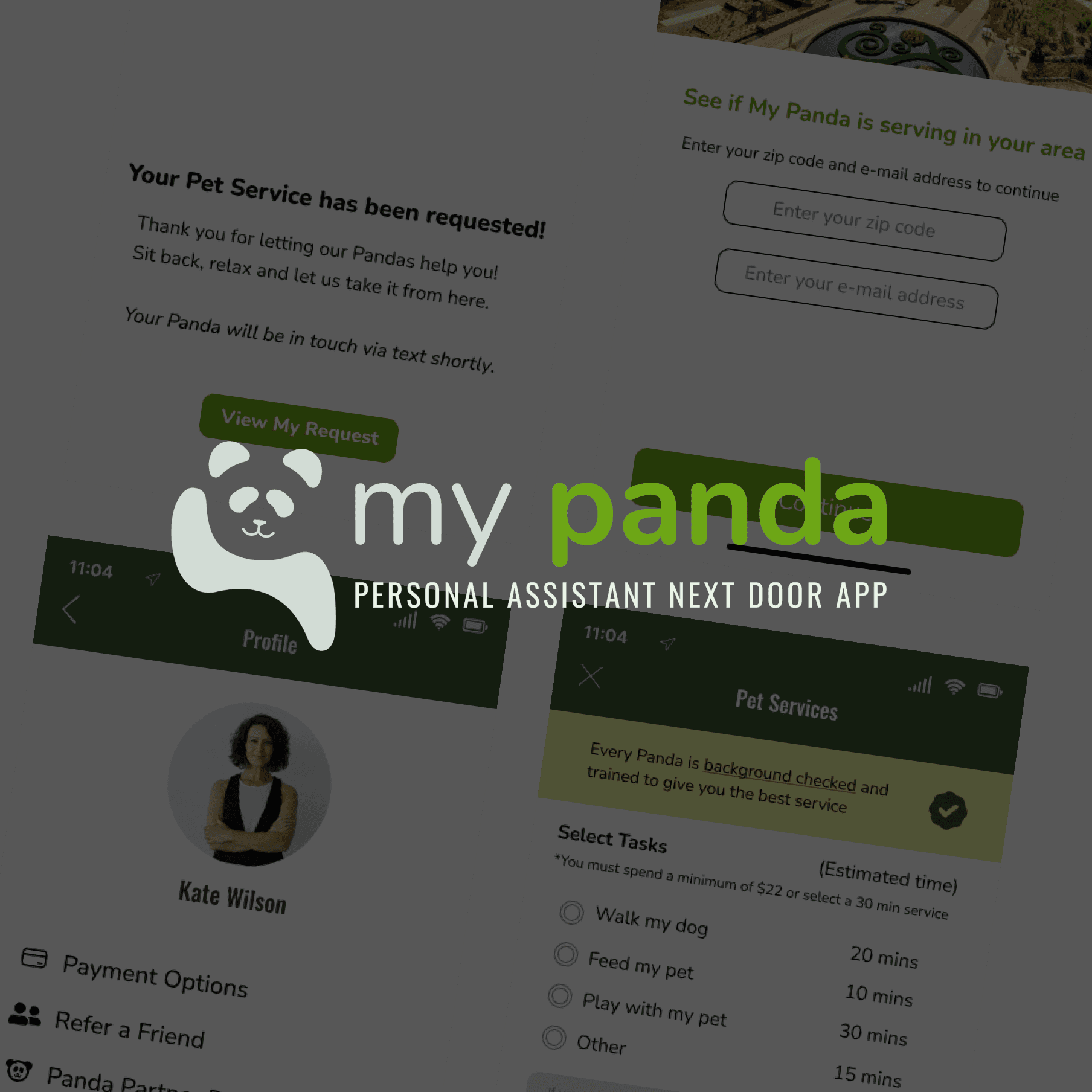
MY PANDA
MY PANDA
MY PANDA